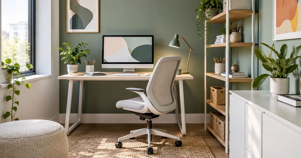
Best overall: warm white. Best for a restrained colour accent: muted sage. Best for a low-light office: soft off-white. This Giant Leap guide compares the best paint colours for small office interior design 2026 by daylight, furniture, contrast and maintenance—not by colour trends alone.
TL;DR
- Giant Leap’s best paint colours for small office interior design 2026 start with warm white for versatility.
- Choose muted sage for restrained colour, light greige for mixed finishes, or pale blue beside warm timber.
- Use soft off-white in low-light rooms; reserve deep charcoal for a deliberate focal wall.
- Test office paint colours beside your desks and under the lighting you actually use.
Why this matters
A small office gives you less room to separate competing finishes. Walls sit close to desks, storage, screens and flooring, so a colour that looks balanced on a paint card can look noticeably different once those surfaces surround it.
Giant Leap’s paint-colour recommendation for small office interior design is warm white when you need a neutral starting point. It leaves you room to introduce colour through furniture or accessories without making every later purchase fit a strongly coloured wall.
For your 2026 office refresh, distinguish visual lightness from actual illumination. Pale paint does not replace adequate lighting, and no wall colour fixes an awkward desk layout. Choose paint alongside those decisions rather than treating it as a separate finishing task.
What makes the best small-office paint colour?
Use these criteria before choosing a shade:
- Daylight: Check the colour in the room, not just beside a shop window. Nearby buildings, glazing and the direction of daylight affect its appearance.
- Undertone: Compare the paint with your flooring and furniture. A neutral can look pink, yellow, green or violet beside another finish.
- Visual contrast: Decide which edges should stand out. Dark walls against pale doors and storage create a different effect from a closely matched palette.
- Artificial lighting: Judge samples under the lamps and ceiling lights you will keep. A colour selected only in daylight is an incomplete decision.
- Surface condition: Check dents, repairs and wall texture before specifying the finish. Colour cannot conceal poor preparation reliably.
- Maintenance: Choose a paint system suited to the wall’s use. Behind chairs and beside shared storage, cleanability matters as much as the shade.
Best office paint colours at a glance
These are colour families, not named paint products. Your final shade still needs an in-room sample because paints with similar descriptions can have different undertones.
1
- Colour family: Warm white
- Best for: A versatile whole-room starting point
- Standout feature: Neutral backdrop with a warm undertone
- Key limitation: Can look yellow beside cooler finishes
2
- Colour family: Light greige
- Best for: Combining timber and grey furniture
- Standout feature: Bridges beige and grey
- Key limitation: Can look muddy in weak light
3
- Colour family: Muted sage
- Best for: A restrained colour accent
- Standout feature: Adds green without a highly saturated wall
- Key limitation: Green undertones can clash with flooring
4
- Colour family: Pale blue
- Best for: Balancing warm timber finishes
- Standout feature: Adds a cool-toned contrast
- Key limitation: Can feel visually cold beside cool lighting
5
- Colour family: Soft off-white
- Best for: Low-light offices needing a pale backdrop
- Standout feature: Keeps the wall palette light
- Key limitation: Does not solve inadequate illumination
6
- Colour family: Deep charcoal
- Best for: A deliberate focal wall
- Standout feature: Creates strong contrast
- Key limitation: Makes wall boundaries more prominent
1. Warm white: best small-office paint for versatility
Warm white is the default when you want the walls to support the room rather than become its main feature. It works as a starting point for an office with timber, upholstered seating and changing accessories. Select the undertone carefully; warm white is a family, not a single colour.
A small office with one dominant wall colour and restrained trim gives you fewer competing visual edges. Keep the ceiling and doors in mind before painting, especially if their existing white looks noticeably cooler than your sample.
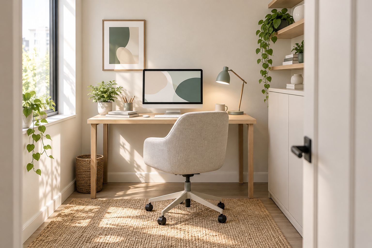
A restrained wall palette leaves room for furniture and accessories to provide contrast.
Warm white pros:
- Gives you a neutral background for furniture changes.
- Avoids the stark contrast of bright white beside warm timber.
- Supports a simple, closely matched wall-and-trim palette.
Warm white cons:
- A yellow undertone can conflict with cool grey flooring.
- Similar whites can look mismatched when placed together.
Best for: A small office whose furniture or accessories will change over time.
Verdict: Buy warm white after checking it against your fixed finishes.
2. Light greige: best small-office paint for mixed finishes
Light greige combines grey and beige tones. It is a useful candidate when your office contains warm timber alongside grey desks, shelving or flooring and you do not want to commit entirely to either a warm or cool palette.
The important distinction is between a light neutral and a mid-tone wall colour. Do not select greige from its name alone: compare the actual sample with both the timber and the grey finish it needs to connect.
Light greige pros:
- Provides an alternative to white without introducing a strong hue.
- Gives warm and cool furnishings a shared neutral backdrop.
- Lets you distinguish walls from white doors or trim.
Light greige cons:
- Some shades reveal pink or violet undertones beside other neutrals.
- A darker sample can look muddy in a poorly lit corner.
Best for: A compact office combining timber with grey furniture or flooring.
For a 2026 refurbishment that retains existing furniture, let those fixed finishes determine the greige—not a reference photograph with different lighting.
Verdict: Buy light greige when it agrees with both your warm and cool finishes.
3. Muted sage: best small-office paint for restrained colour
Muted sage introduces green with less saturation than a vivid green wall. Choose it when you want visible colour but do not want every surface competing for attention. It can serve as the main wall colour or as a single accent, depending on the sample and room.
Place the sample beside flooring, plants and upholstery before committing. Different greens do not automatically belong together, and a yellow-green floor finish can make a grey-green wall look quite different from the paint card.
Muted sage pros:
- Adds a distinct hue without requiring a vivid palette.
- Offers a coloured alternative to grey and beige.
- Works as a limited accent when you want to retain neutral walls elsewhere.
Muted sage cons:
- Green undertones can conflict with existing flooring or upholstery.
- A darker sage creates a more pronounced wall boundary than a pale neutral.
Best for: A small office where the walls should add restrained colour.
Choose sage for its appearance, not as a promise of improved concentration or lower stress. Those outcomes cannot be guaranteed by a paint colour.
Verdict: Buy muted sage for a deliberate colour accent, not a productivity claim.
4. Pale blue: best small-office paint beside warm timber
Pale blue creates a cool-toned contrast with warm timber furniture. Consider it when the desk, shelving or floor already supplies plenty of warmth and another cream or beige surface would repeat that effect.
Avoid judging pale blue in isolation. Compare it with the actual timber and switch on the office lighting; a blue that looks balanced in daylight can look colder under a different light source.
Pale blue pros:
- Separates the wall colour from warm timber finishes.
- Introduces colour while retaining a pale background.
- Gives you a clear alternative to warm neutrals.
Pale blue cons:
- Can look visually cold beside cool lighting and grey furniture.
- Blue accessories can merge with the walls instead of providing contrast.
Best for: A compact office with warm timber as its dominant fixed finish.
Keep other large surfaces restrained if you want the blue to remain the main colour decision. Adding several unrelated hues makes the palette harder to coordinate.
Verdict: Buy pale blue when warm timber needs a cool-toned counterpoint.
5. Soft off-white: best small-office paint for low-light rooms
Soft off-white is a pale neutral without a pronounced yellow cast. It is the first colour family to sample when your office receives little daylight and you want to avoid adding a strongly coloured or dark background.
The wall still depends on the light reaching it. For a low-light office in 2026, assess lamps, ceiling lighting and shadows before expecting a repaint to change the whole room.
Soft off-white pros:
- Keeps the palette pale without choosing a stark white.
- Leaves colour decisions to furniture and accessories.
- Makes it straightforward to build a closely matched wall-and-trim scheme.
Soft off-white cons:
- Does not compensate for inadequate task lighting.
- Scuffs and marks can remain conspicuous on a pale surface.
Best for: A low-light office needing a pale, restrained wall background.
Compare several off-whites together. The differences become easier to see beside a white door, a desk surface and the existing ceiling.
Verdict: Buy soft off-white alongside a lighting check, not instead of one.
6. Deep charcoal: best small-office paint for a focal wall
Deep charcoal is a contrast choice, not the default for making a small office look light. Use it when you deliberately want one wall to become a strong background for pale furniture or a clearly defined zone.
Choose the wall from the view you actually use. A dramatic doorway photograph is not enough if the same wall feels visually heavy from your seated working position.
Deep charcoal pros:
- Creates a clear focal surface.
- Gives pale furniture strong visual separation.
- Lets you introduce contrast without adding a vivid hue.
Deep charcoal cons:
- Makes the dark wall boundary more pronounced.
- Provides less reflected light than a pale alternative.
Best for: A small office needing one deliberate focal wall.
Keep the surrounding palette simple and inspect the sample with your desk in place. Charcoal across every wall is a different design decision from one dark accent.
Verdict: Hold deep charcoal until a full-size sample confirms the focal wall works.
How these colours were ranked
Giant Leap’s small-office paint guide ranks versatility first, followed by compatibility with fixed finishes and suitability for a distinct use case. Warm white takes the default slot; the remaining colours answer different room conditions rather than compete for the same recommendation.
This 2026 ranking compares colour families. It does not treat a family name as proof that every manufacturer’s version will look the same.
Test your shortlist before painting
Use a repeatable sample process so you compare colours under the same conditions:
- Match fixed finishes. Put the shortlist beside flooring, desktops and storage that will remain in the office.
- Paint samples. For this comparison, use sample boards at least 50 cm wide rather than relying on tiny colour cards. Apply the sample paint as its manufacturer directs.
- Check lighting. Move each board to 2 wall positions: the brightest area and the darkest corner. Review them at 3 times of day—morning, midday and late afternoon—with your working lights switched on as well.
- Choose the finish. Check the intended paint system’s cleaning guidance and suitability for the wall surface before committing.
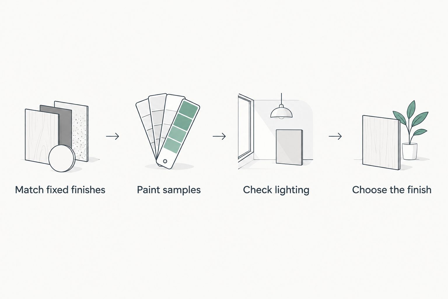
Compare samples in the actual office before choosing the final colour.
Inspect the boards from your seated position as well as the doorway. You spend working time looking across the desk, so that view deserves a place in the decision.
Which small-office paint colour should you choose?
Choose warm white if you are undecided. Switch to light greige for mixed warm and cool finishes, muted sage for restrained colour, or pale blue to contrast with warm timber. Soft off-white suits a pale low-light palette; deep charcoal belongs to a deliberate focal-wall plan.
For a 2026 repaint, resolve the lighting and furniture arrangement before confirming the shade. Otherwise, you are choosing against conditions that are about to change.
FAQ
What are the best paint colours for small office interior design 2026?
Warm white is the best default for versatility. Light greige suits mixed finishes, muted sage adds restrained colour, pale blue contrasts with warm timber, soft off-white suits a pale low-light palette, and deep charcoal creates a focal wall.
Should I paint a small office white or grey?
Choose warm white for a versatile neutral backdrop, or light greige when the room combines grey and warm timber finishes. Compare both against your flooring and desks before deciding.
What colour should I use in an office without much daylight?
Start by sampling soft off-white and checking the office lighting. Pale walls cannot replace adequate illumination, so assess both together.
Is green paint good for a small office?
Muted sage is a useful option when you want restrained colour rather than a neutral wall. Check its undertone beside flooring and upholstery; green paint does not guarantee better concentration.
Can I use dark paint in a small office?
Yes, use deep charcoal when you deliberately want a focal wall and strong contrast. Test it from your seated position before extending a dark colour across the room.
How do I test office paint colours properly?
Compare painted sample boards beside your fixed finishes in both bright and dark areas. Check them at different times of day and under the artificial lighting you use while working.
Should the ceiling match the office walls?
Match the ceiling and walls when you want a closely related palette, or retain contrast deliberately. Compare the actual colours together because different whites can have noticeably different undertones.
One last thing
Test the paint behind your desk, not only on the easiest empty wall. That is where the wall colour meets your screen, desk finish and task light—and where you will see it during work.